 |
||||||||||||||||||||||||||
  
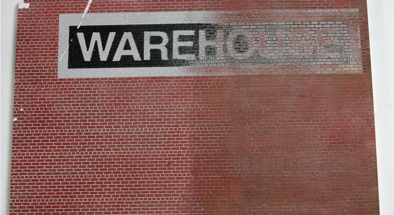
Creating Signs Creating faded painted text. This is page 4 of 4. Page 1: General overview and introduction. Page 2: Creating a wall mounted billboard. Page 3: Creating a roof top marque. Page 4: Creating faded painted text. This is the faded paint sign we are going to make. 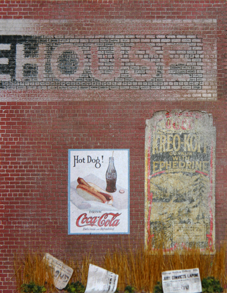 The 1/2" vinyl letters were from an office supply store and cost under $5.00. 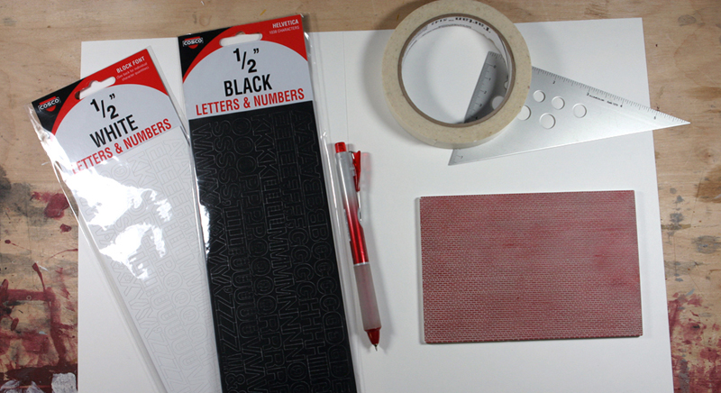 I masked off the area for the letters. As the letters were 1/2" tall I needed to make sure that I masked off at least 1/2" plus some extra for a white border around the black box the letters were going to be in. I made the area just over 1" tall and I used the mortar lines to tape the area off straight. 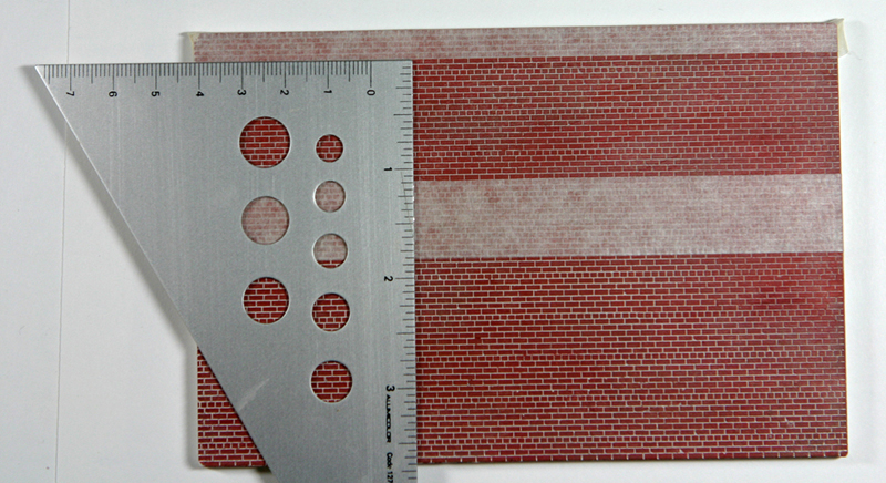 I then masked off the rest of the wall. 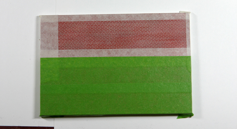 The area is spray painted flat white. 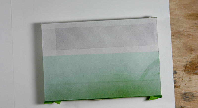 I applied the vinalvinyl letters. The color you choose doesn't really matter because they're going to be painted over then removed. I used black because they showed up on the white better. 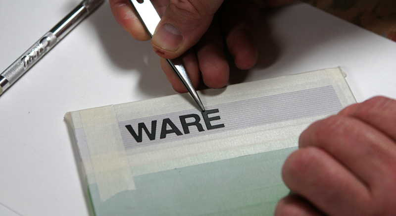 I peeled the letters off the backing with tweezers. 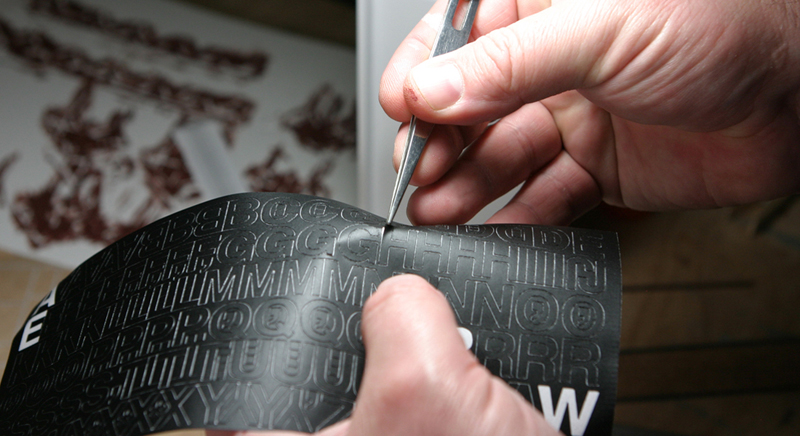 The lettering is complete 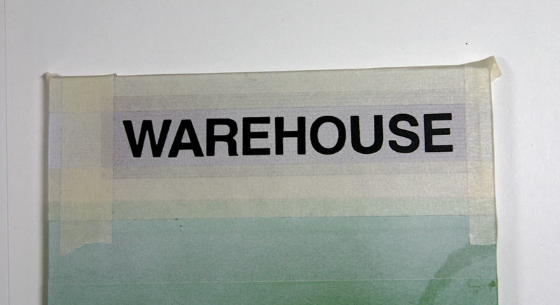 It is spray painted flat black. 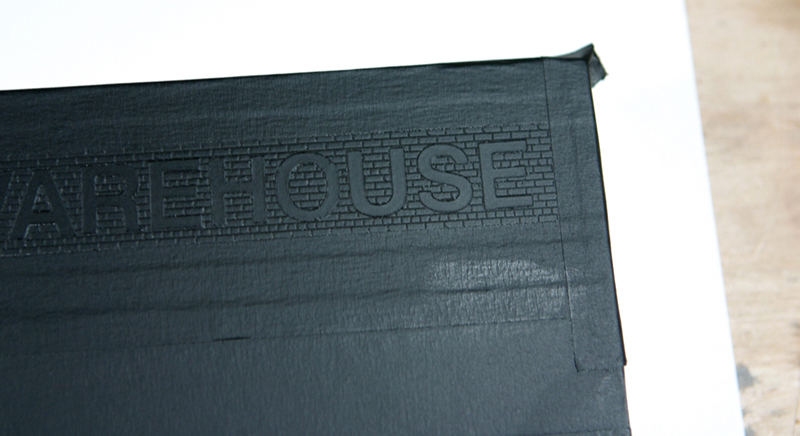 I have removed part of the lettering to reveal the white paint below. You'll note that a small amount of the black leaked under the lettering. That is because I did not paint the wall straight on but from an angle. (My mistake) Also, I cracked the brickwork while putting on the masking tape. A way to help prevent that, according to Russ Greene from New England Brownstone, is to glue sheet wood to the back of the brick work to thicken the walls. 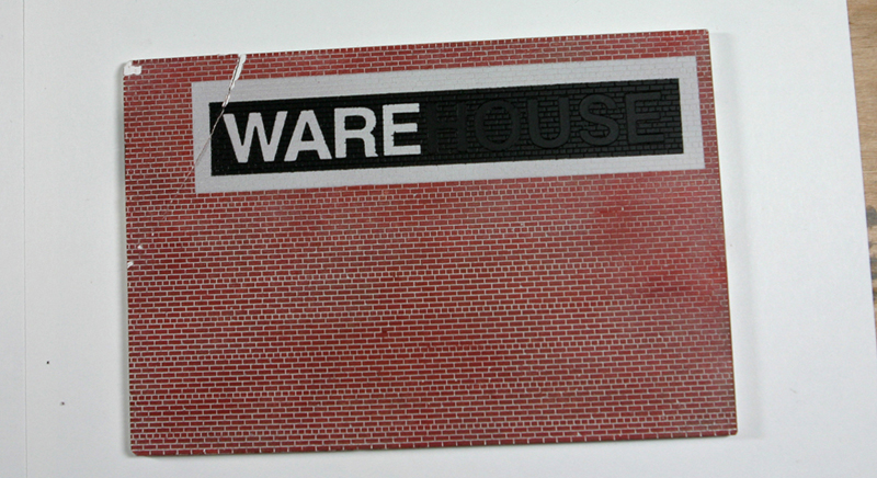 I used a 0000 steel wool pad from a hardware store. (about $4 for 12 pads) It is important to rub lightly as your removing the upper layers of the paint. If you press to hard you'll (1) leave scratch marks on the paint and (2) eventually take the paint off the bricks bringing the surface down to expose the plaster brick work. (white) 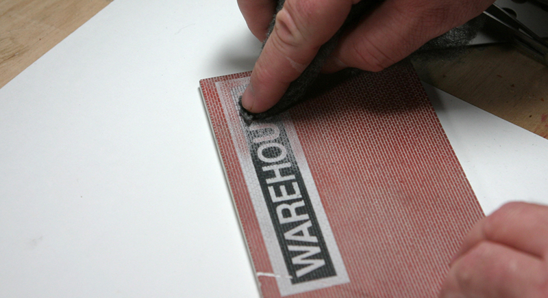 I weathered only half the wall to compare the new look to the old faded look. 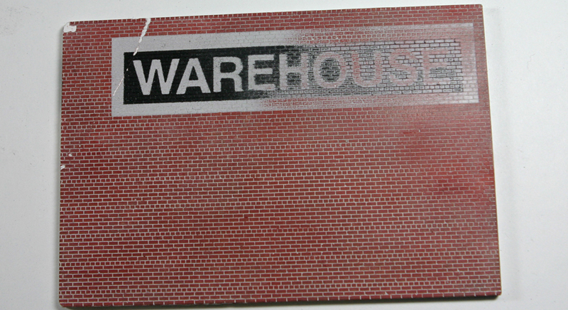 Here is a close up of the weathered warehouse sign. 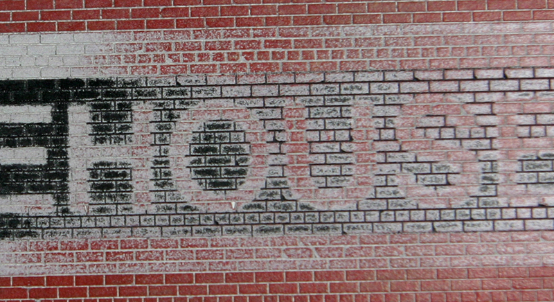 Here is the process I used to make the wall look aged:
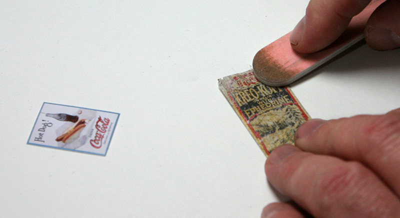
 I printed a couple signs for the wall. The Kreo-Koff sign was scanned from a medicine box I purchased at an antique store and the Coke sign showed up in a image google search of "signs from the 1920's" 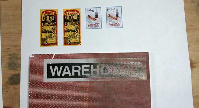 Both signs were cut out with a pen knife. 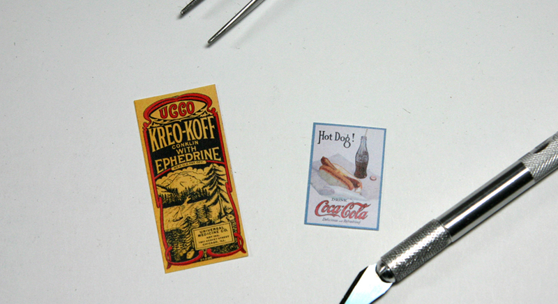 I left the Coke sign new and aged the Kreo-Koff sign by:
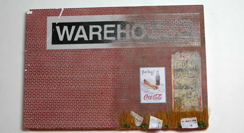
 With everything place together I felt the Kreo-Koff sign was still to "stiff" to look old. 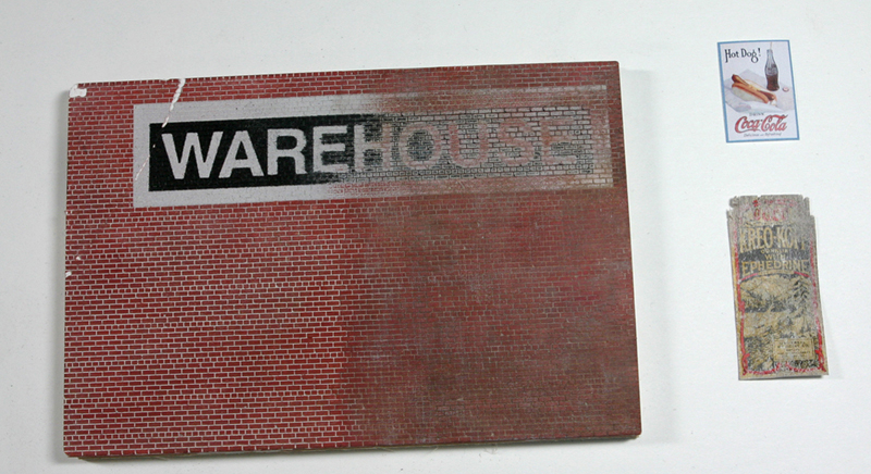 I carefully bent some of the top of the sign to make it look as if though it was peeling away from the wall from being there a long time. I did not peel-up the bottom of the sign. 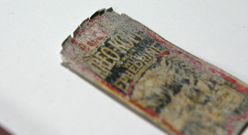 I was not careful when covering the back with glue. 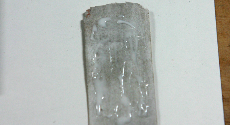 I place the two signs were I wanted them. 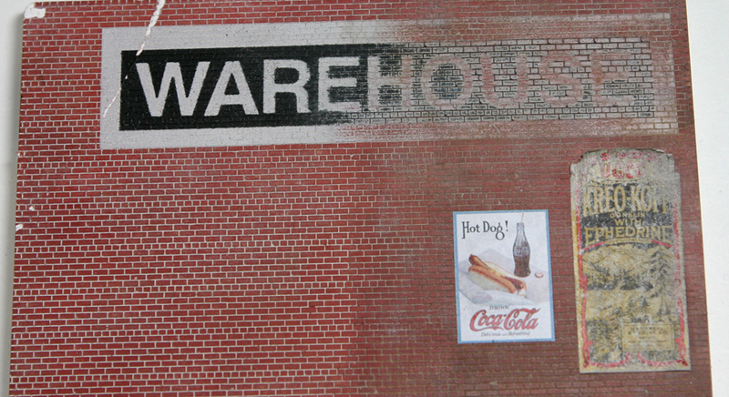 For a few final touches I:
 This is page 4 of 4. Page 1: General overview and introduction. Page 2: Creating a wall mounted billboard. Page 3: Creating a roof top marque. Page 4: Creating faded painted text. |
||||||||||||||||||||||||||
|
© Bollinger Edgerly Scale Trains. Legal. |
||||||||||||||||||||||||||

|
||||||||||||||||||||||||||